


Summary
Channel letter signs are among the most popular building-mounted solutions out there. Following these tips will help them stand out any time of day.
Are you looking for the most effective channel letter sign?
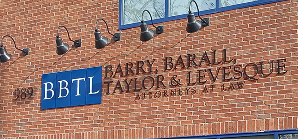
Channel letter signs are an ideal choice for any business who wants an eye-catching sign mounted to their building. With a great deal of customization options, three-dimensional qualities and the ability to be lit for visibility at all times, it’s no wonder so many companies turn to channel letters to identify their storefront.
Channel Letter Sign Tips
The staff at G-Force Signs & Graphics has years of experience. We use our knowledge of the signage industry to create the best signage to fit our clients needs. We specialize in channel letter signs and the tips listed below will ensure your signs look great and perform well.
Font
Remember to view your sign as your consumer would. People must be able to read and understand the sign in a split-second, so readability of the font you choose is key, and simple fonts perform the best. Sans-serif fonts are also best for illumination, because the small points of serif fonts are difficult or sometimes impossible to light.

Face Color
While you always want your sign to match your branding, darker blues, greens and burgundy can absorb color and lead to a difficult to illuminate sign. If your branding features these colors, consider using them as accents rather than the main letters.
Font Weight
Your letters need to have a font weight large enough to mount LEDs and run wiring. To ensure it is large enough for an LED strip to fit inside select a font weight that is usually 1.5” wide or larger.
Contrast
Consider the color of the building you are mounting the sign to, does your proposed design pop and catch the eye of passers-by? We’re always happy to provide a proof of the sign mounted on the building prior to production, which can go a long way in determining if the contrast is sufficient.

Mounting Surface
This applies to signs with reverse or halo lighting behind the letters themselves. If the surface is jagged or textured, or is a color which will blend in with the sign, consider installing a backer to really make the sign stand out.
Position
Some clients have a set position on their building where a sign can be installed, but if you own the whole building then carefully examine where the sign will be seen the most. This is another instance where a mock-up can be beneficial.
Letter Size
Speaking of mock-ups, it’s important to envision the sign’s size before installation. The last thing you want is a sign which is too small to be seen, so work with your sign provider to determine an appropriate size which will be legible from the most high-trafficked area nearby.

Illumination Quality
You want your new sign to stand out at any hour, so selecting bright LED lights from a reputable dealer is very important. Dim lights or ones with a propensity for premature failure often will ruin the effectiveness of your sign.
Finding the Right Signage Partner
Signage is not a “one size fits all” type of product and often requires experience and expertise to ensure the final result is a quality sign that represents your company for years. Regardless of what company you choose to help you with your signage project, be sure to find one that can create the sign that is right for your company.
G-Force Signs & Graphics, a local company based right here in Connecticut, would love to partner with you for your next project. We can help you find the right sign to fit your needs, whether it is for a channel letter sign or any other need you might have.
For more examples please visit our channel letters page!